Beyond Looks
The Problem
Plenty of interior design ideas can be found online to decorate a home but there is no simple way to replicate them
The Solution
An easily accessible site allows customers to shop for the products they see in the pictures
My Role
I was handed the brief and was the sole designer of the product and I used Omnigraffle and Axure to create my work.

Analyzing the competition
A competitive analysis plays a critical role in the success of a business. Identifying the competitors and evaluating their strategies allow a business to find its palace in the market and its key differentiators.
In order to better understand the scope of this product, I conducted a competitive analysis of the sites that provide a service similar to what the brief described.
One Kings Lane and Joss&Main offer beautiful pictures but lack the option of replication the specific look seen in the picture. Houzz offers spectacular options with one catch, a “PRO” has to be hired to recreate the view. Sure, interior designers and architects can recreate it but users can’t. Beyond Looks fills that gap and allows users to replicate a look, buy all the products in that specific look and filter through looks quickly.
Discovering the navigation criteria
How to present the “looks” in a way that the user would be able to find them quickly and accurately? Card sorting was my method of choice in this case. It allowed me to uncover how the users categorize the different options and structure the site accordingly.
I chose a set of filters to accommodate for the variety of properties each “look” would have. The following filters emerged based on the user research and personas: Room, Style, Budget, Stylist and Brand.
I went on to create a sitemap in Omnigraffle which included the many aspects of the site, including account access, checkout process, shopping list access, browsing, etc.


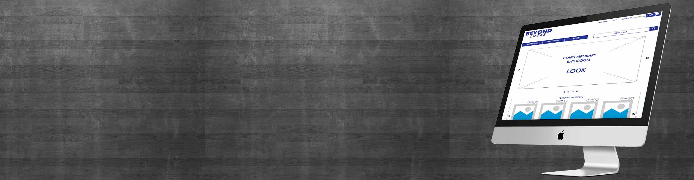
Wireframing the skeleton
The sitemap gave me a better understanding of the overall site and allowed me to start creating the wireframes with the different user flows in mind. Sketching by hand was key to understanding the different elements of the site and their placement.
I then proceeded to use Axure to wireframe the solution. The rest of the time was spent using Axure to create the many pages that the site required.
Improvements through usability testing
With wireframes at hand I pursued usability testing which uncovered several important changes to the site.
1. Users preferred having a filtering page instead of arriving directly at the “look” page. That’s where the look selection page was conceived.
2. Originally the check out process had an extra page which allowed customers to select gift options.
Based on user testing I realized that the gift options could be seamlessly incorporated into the review page thereby condensing the checkout process and improving efficiency.

